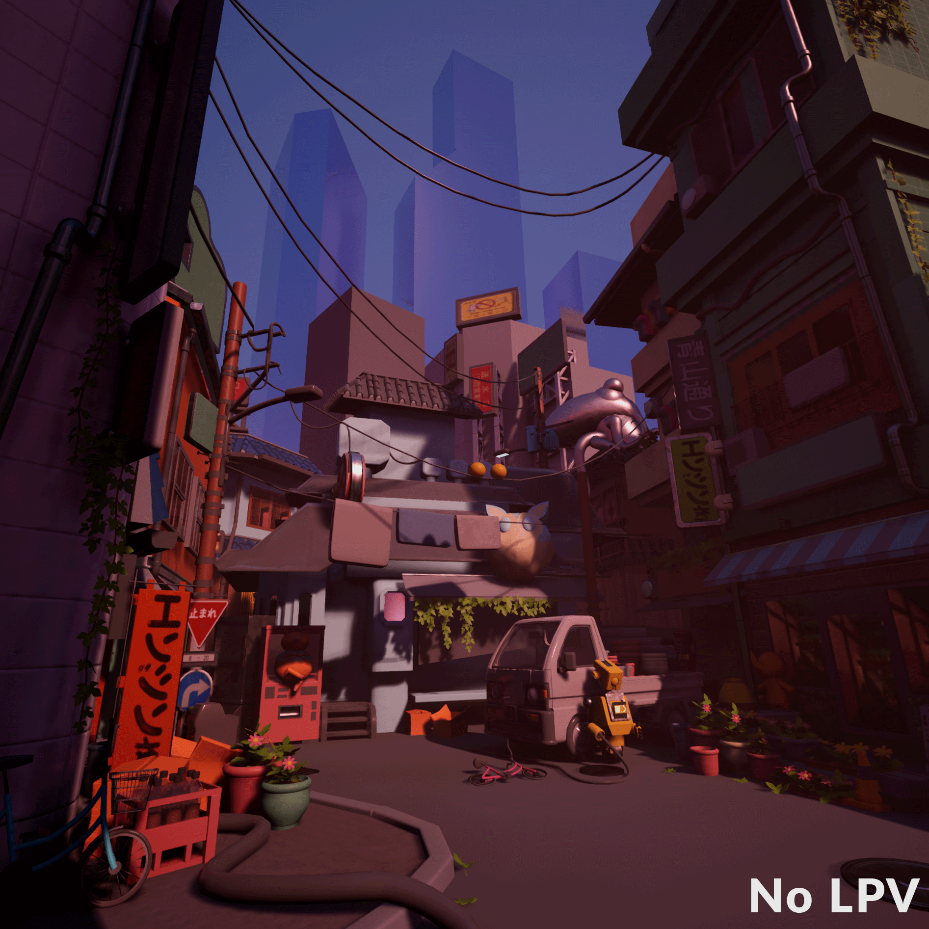
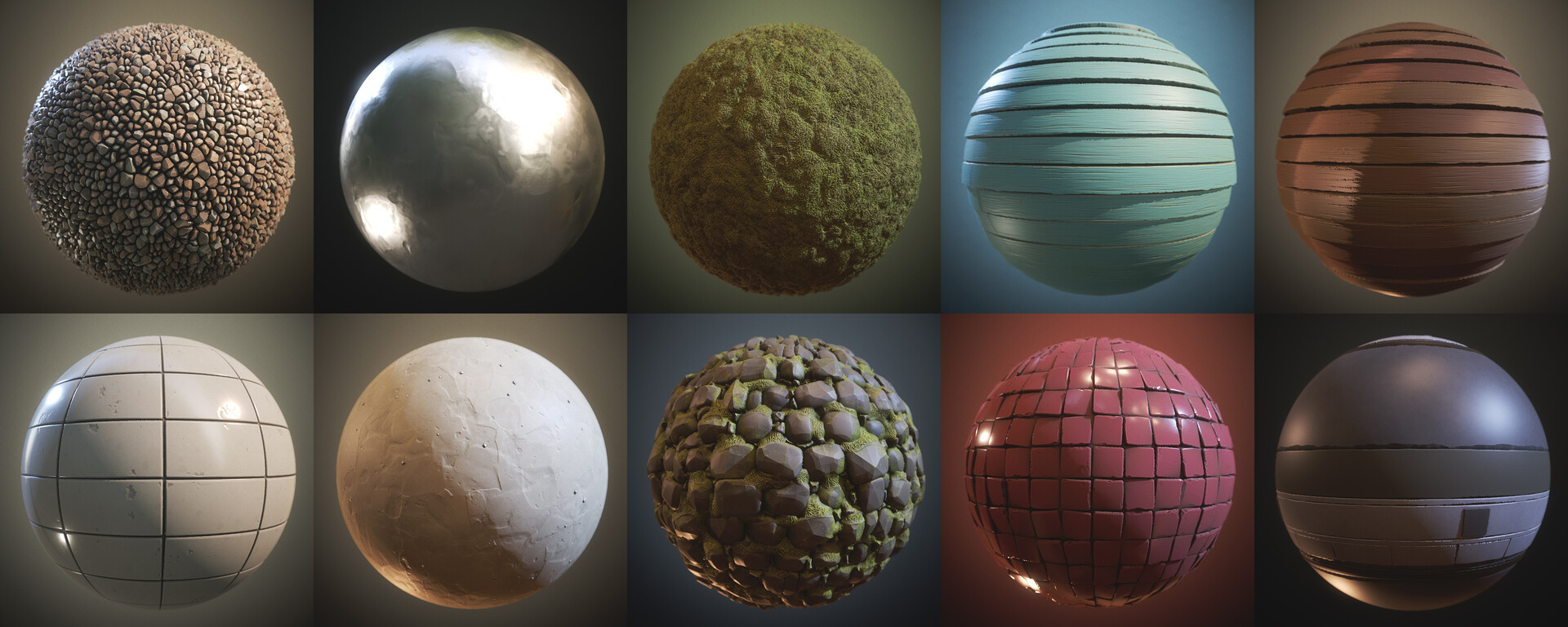
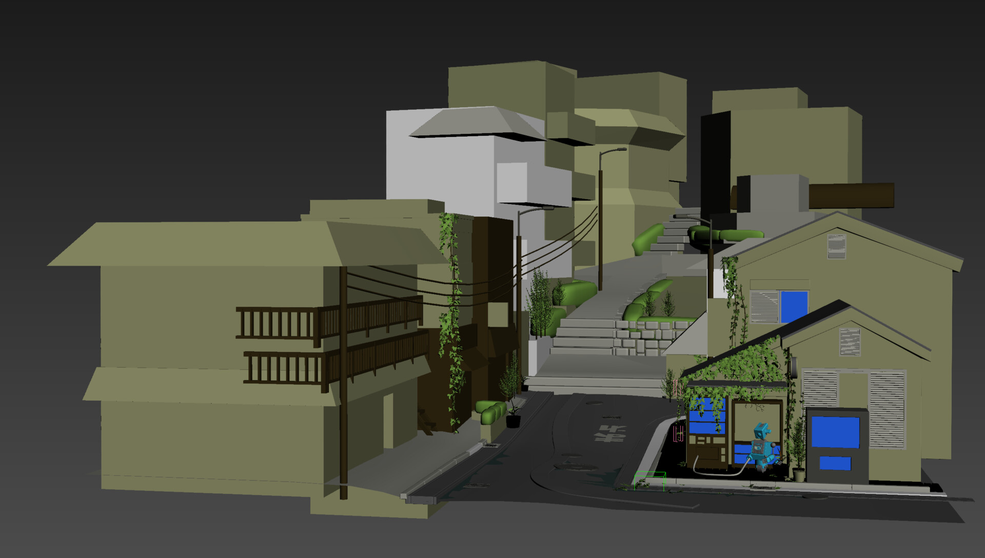
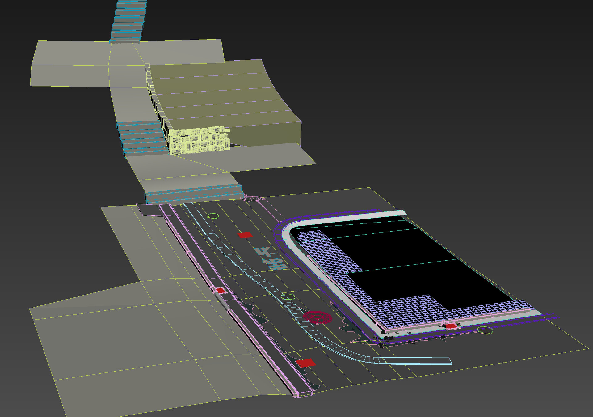
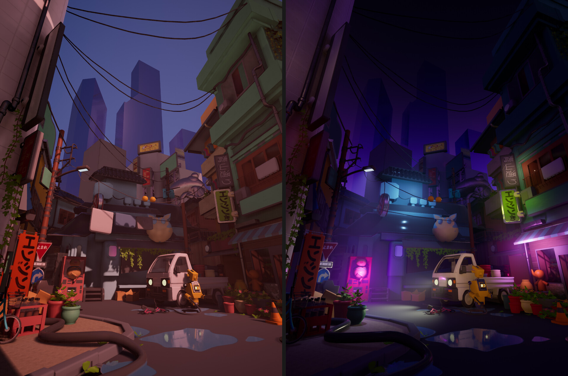
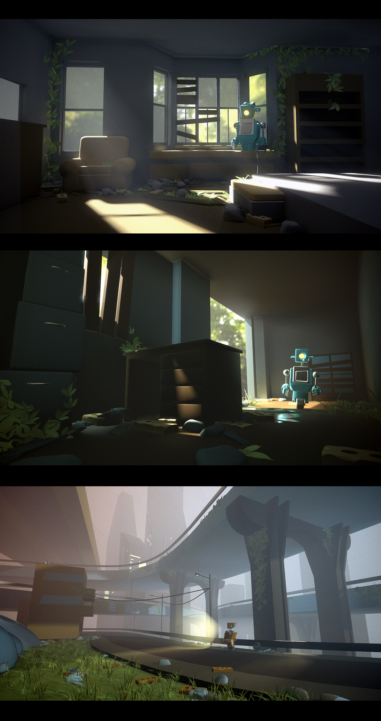
Some of you may know that recently I have invested some time into learning the wonders of Blender. I wanted to write a couple of informative blog posts about tutorials that helped me in my journey to learning the software. It is useful to know that before this I was predominantly a 3DS Max user and had used a little bit of Maya as well.
A shout out to Ivan Nestorov for his help as I bothered him lots with my questions and he was a great help.
Free resources
I confess that I only watched part of this as I was already fairly comfortable with Blender when it was released. It is a good place to start as a complete newbie to the software.
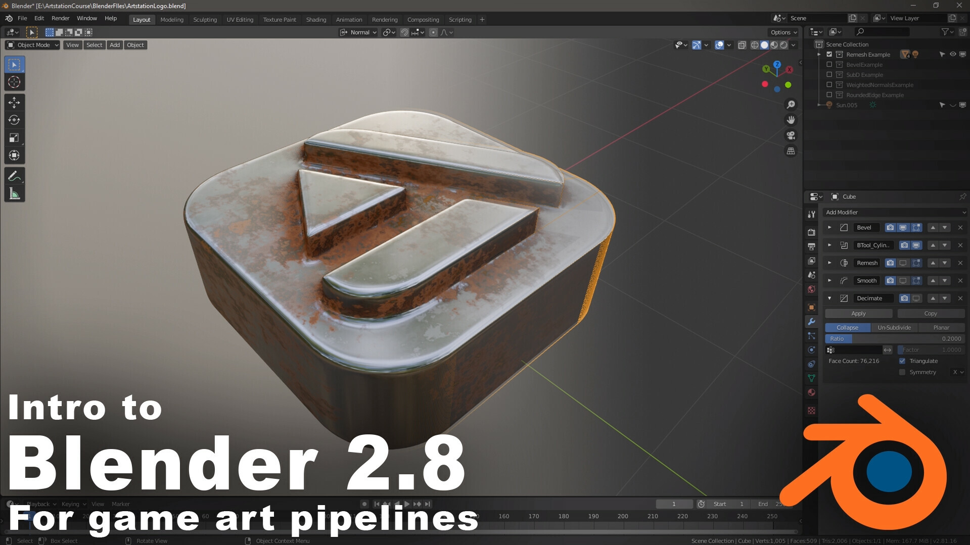
Andrew Price aka Blender Guru has lots of great Blender tutorials on his YouTube channel and is generally just an interesting person to learn from. I found a lot of his tutorials were great to just chill out and watch when you had some spare time. Especially for topics I might not normally look at such as rendering. He has good beginner series for 2.8 as well.
He also has a bunch of great general 3d tutorials not related to Blender such as lighting, composition and colour.

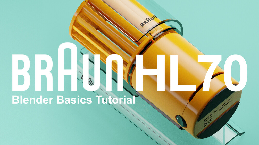
Heavypoly YouTube has a bunch of beginner YouTube videos which you can watch for free and he has some paid content so he features in both sections. The Braun desk fan prop was one of the first Blender videos I found. Heavypoly has a great style to his tutorials, they are entertaining and the humor is compelling to watch. I bought a bunch of the his paid tutorials as well as I enjoyed his style.
Transitioning from other modelling packages
Along the way I found a couple of videos to make the process of learning Blender from the perspective of another modelling package.
I found this video by flipped normals to be helpful and informative. Flipped normals has an impressive collection of videos with a lot of great topics. This video is a good place to start if you already know how to model in other 3d packages.
Switching to Blender - Flipped Normals

Another video I watched focused on transitioning from 3DS Max to Blender specifically. Although a lot of videos will tell you to keep the default Blender control scheme I actually changed my controls such as move and rotate to match 3DS Max. It eased the transition and helped to make me feel comfortable in Blender right away.
My advice would be to try and keep as many native Blender controls as you can. This makes watching tutorials a little easier while you learn the controls and shortcuts and you can always customize it to your needs once you are comfortable. The only time I changed controls was when I felt I was really battling against my natural modelling instincts.
Blender 101 - Learning Blender as a 3ds Max User
 Paid Resources

Aidy Burrows and Gleb Alexandrov (Creative Shrimp)
These guys have YouTube channels with some excellent free content but they are mainly known for their hard surface modelling tutorial in Blender. I found this was a great intro to a lot of the tools and techniques for hard surface modelling. The commentary is great for learning Blender but also just generally good practice 3d modelling techniques. With some great cheesy jokes! They also did a free 2.8 update on their you tube channel.

As mentioned in the free section Heavypoly has a great YouTube channel of free tutorials. He also has a Gumroad with paid tutorials, I found the crab bot and cargo spaceship were pretty in depth useful videos to pick up more skills in Blender. Plus the end result is pretty cool and that interested me enough to make me want to watch the videos.

Number one takeaway
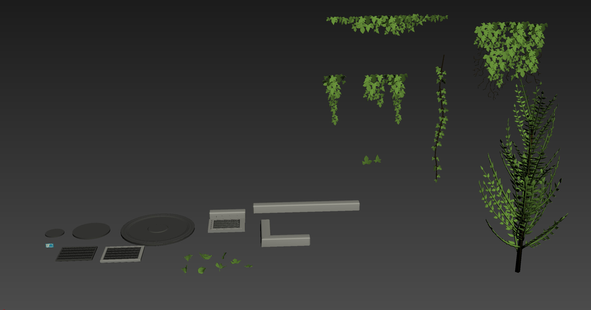
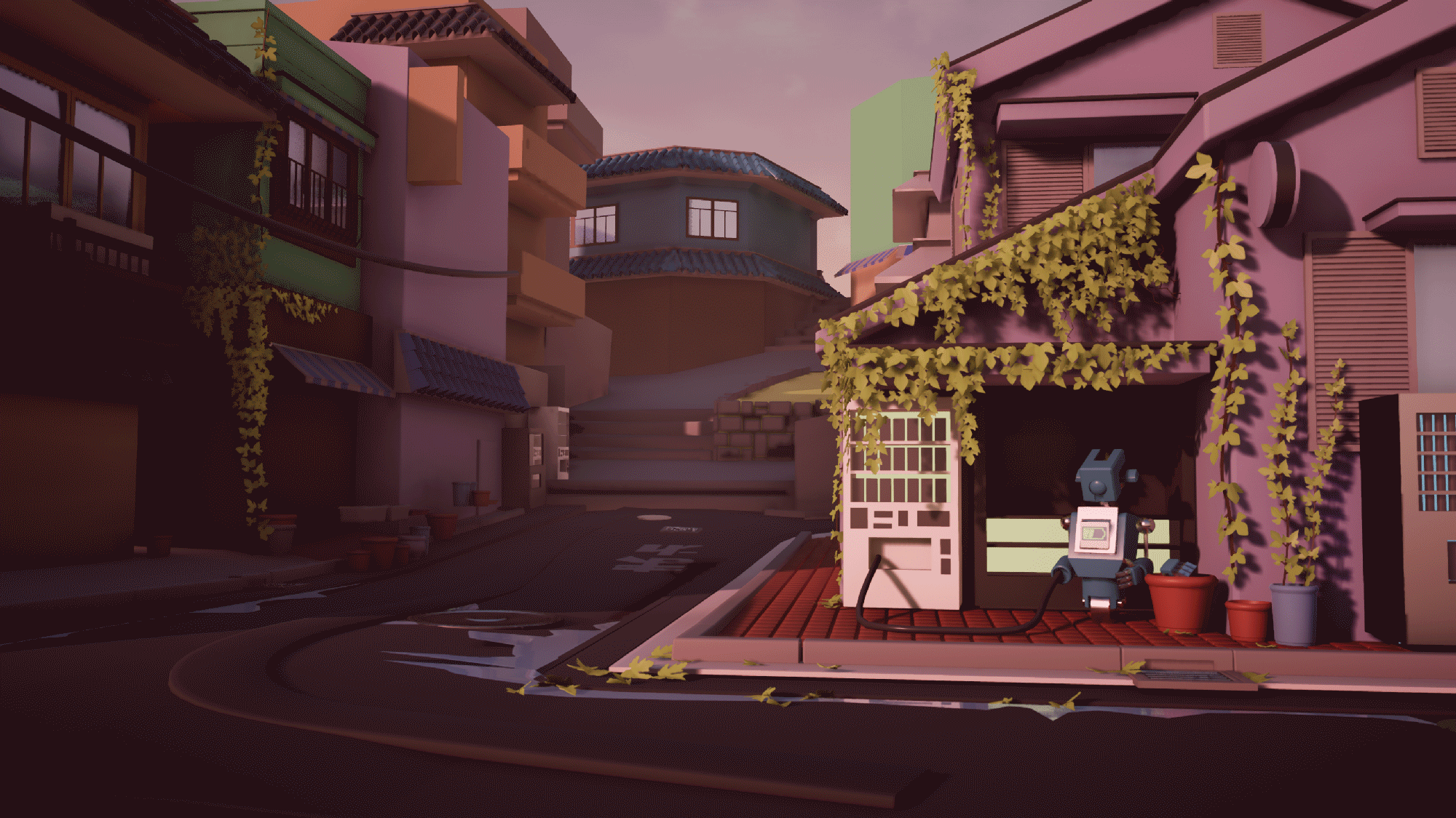
Pick an asset and try and do the whole pipeline.
- High poly
- Low poly
- Uvs
- Texturing
- Get it into an engine
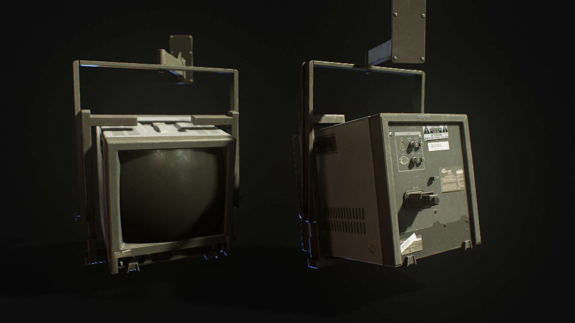
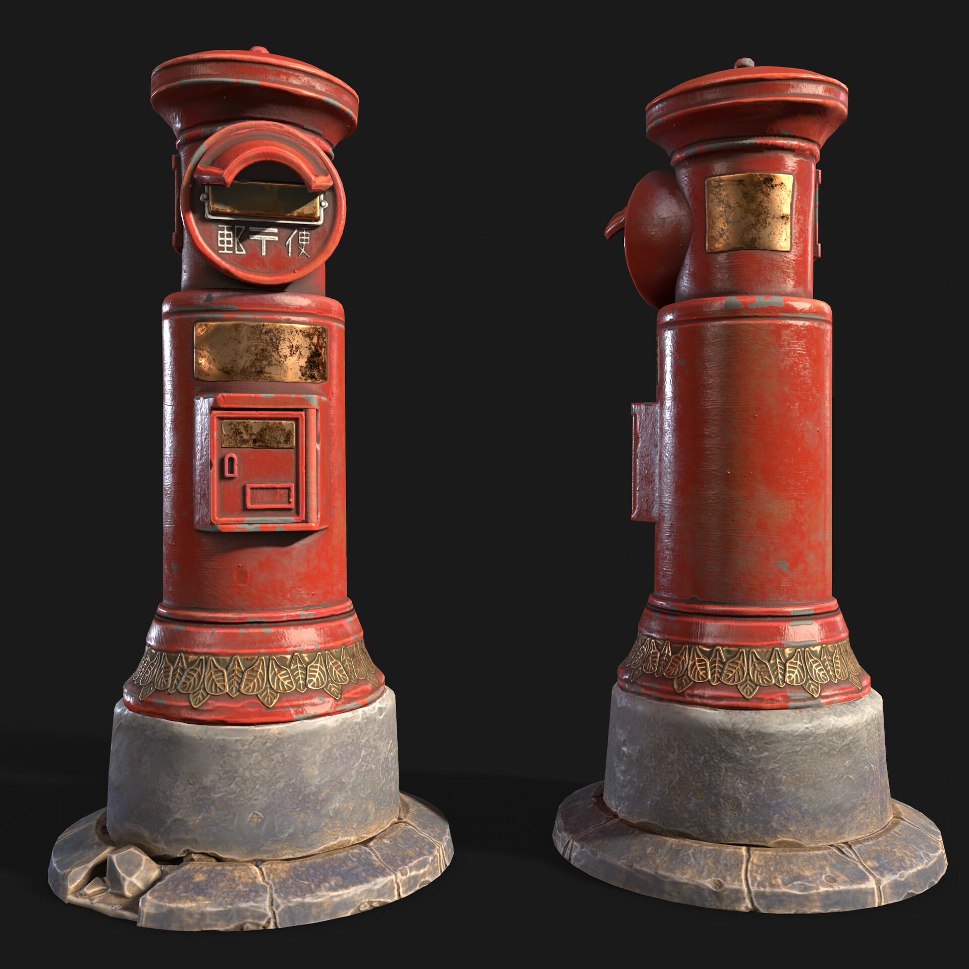
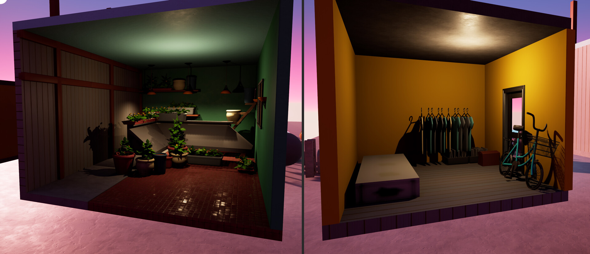
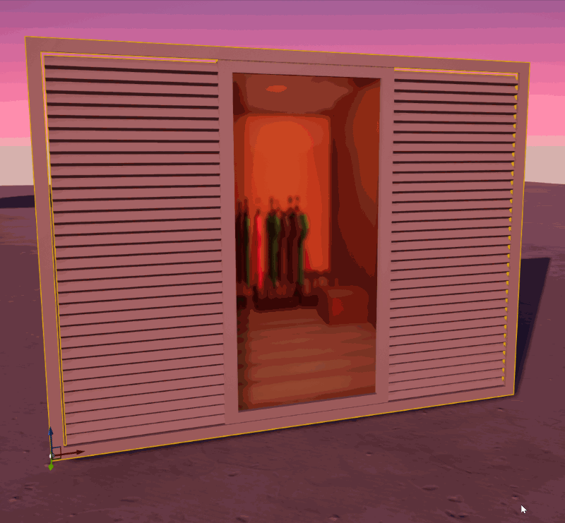
Having learnt different 3d software in the past, I have found this was the best way to learn. I did a small CCTV screen as my first proper asset. This way I would run into problems. As I already know how to model, I would have an approach or technique in mind from 3DS Max. However I wasn't sure how to approach it in Blender. For example - how do I do target weld?
It would force me to jump on to google and learn how to do that technique. I would struggle and sometimes I would have to look up solutions more than once. However eventually it started to stick. This way of learning and struggling meant the information is committed to memory.
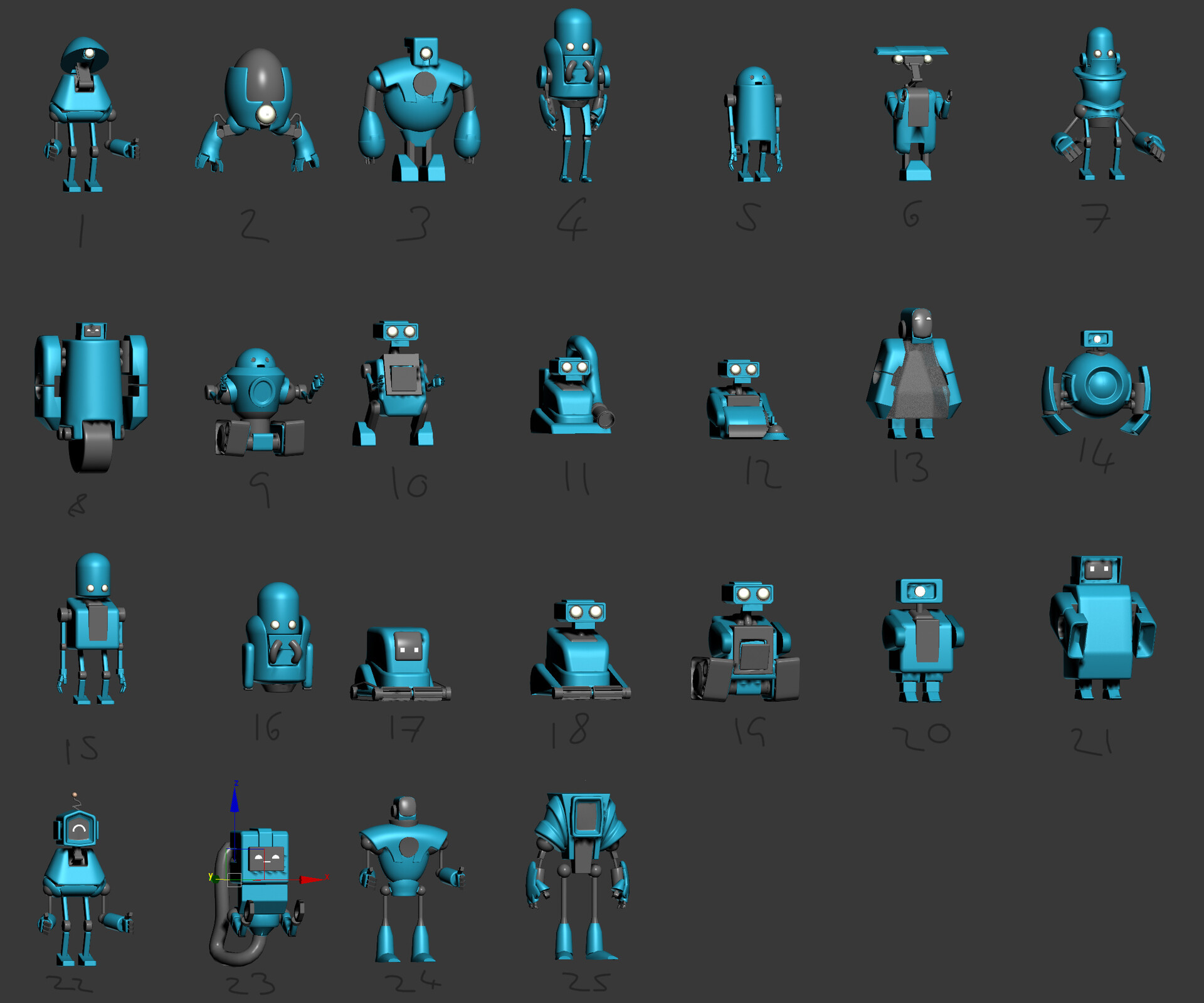
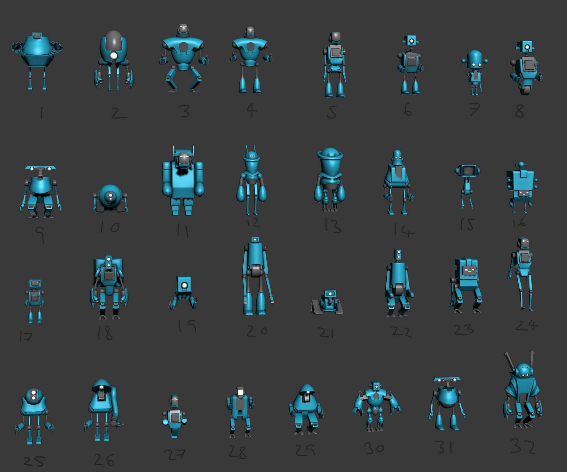
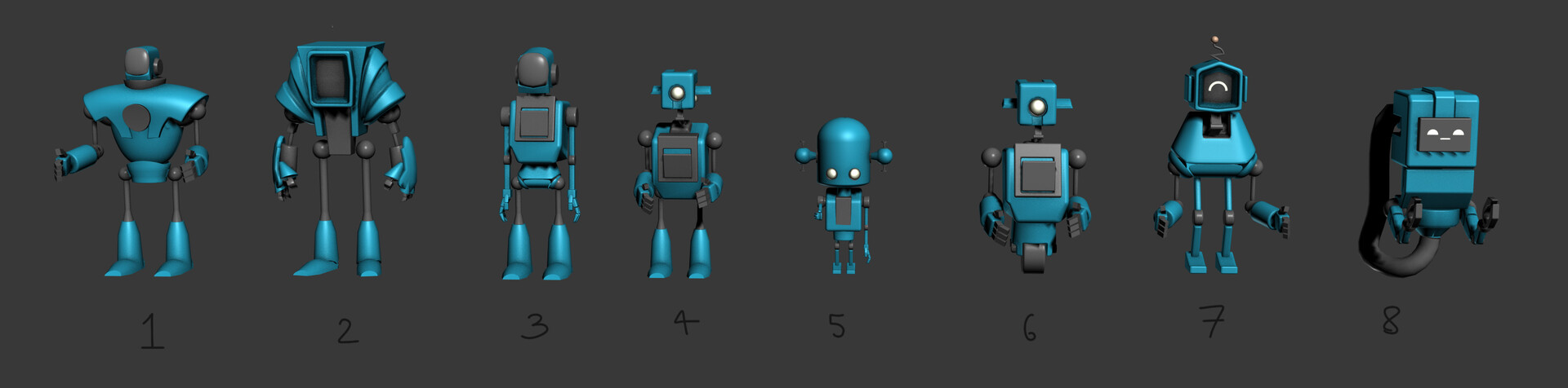
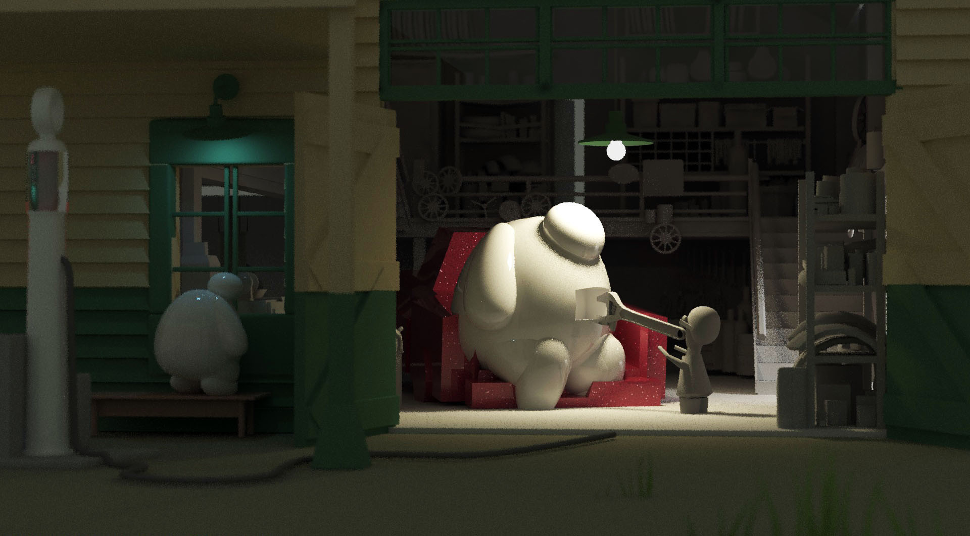
All images are copyright to the original authors.


